Why One-Page Sites Make the Best Therapist Websites (Especially for First-Timers)
So, you’re getting ready to launch (or maybe refresh) your private practice website, and you're wondering: what actually makes the best therapist websites? Do you need a sprawling 10-page site, fancy animations, or a full branding package before you go live?
Good news: You don’t.
In fact, some of the best therapist websites are simple, strategic one-page designs—and today, I’m going to tell you exactly why a streamlined site is often the perfect fit for therapists just starting out, pivoting niches, or breathing new life into an outdated site.
But first—hey there! I’m Emily. I design creative, strategic one-page websites for therapists, coaches, and consultants who want an online home that feels just right. If you’re ready to create a website that connects with your dream clients (without the stress), Book a discovery call with me today!
Alright, let’s dive into why one-page sites often turn out to be the best therapist websites for growing your practice!

Simple Can Still Feel Polished: Why Less Really is More
One of the biggest myths I hear from new therapy clients is that you need a giant, complicated website to look credible.
The truth? A simple, one-page website—when designed thoughtfully—can look just as polished, professional, and trustworthy as a larger site.
Some of the best therapist websites keep things focused. They aren’t trying to be everything to everyone. Instead, they clearly share who you are, who you help, and how you help—all while making it easy for clients to take the next step (like booking a session!).
Less overwhelm for you.
Less confusion for your visitors.
More meaningful connections.
What’s not to love?
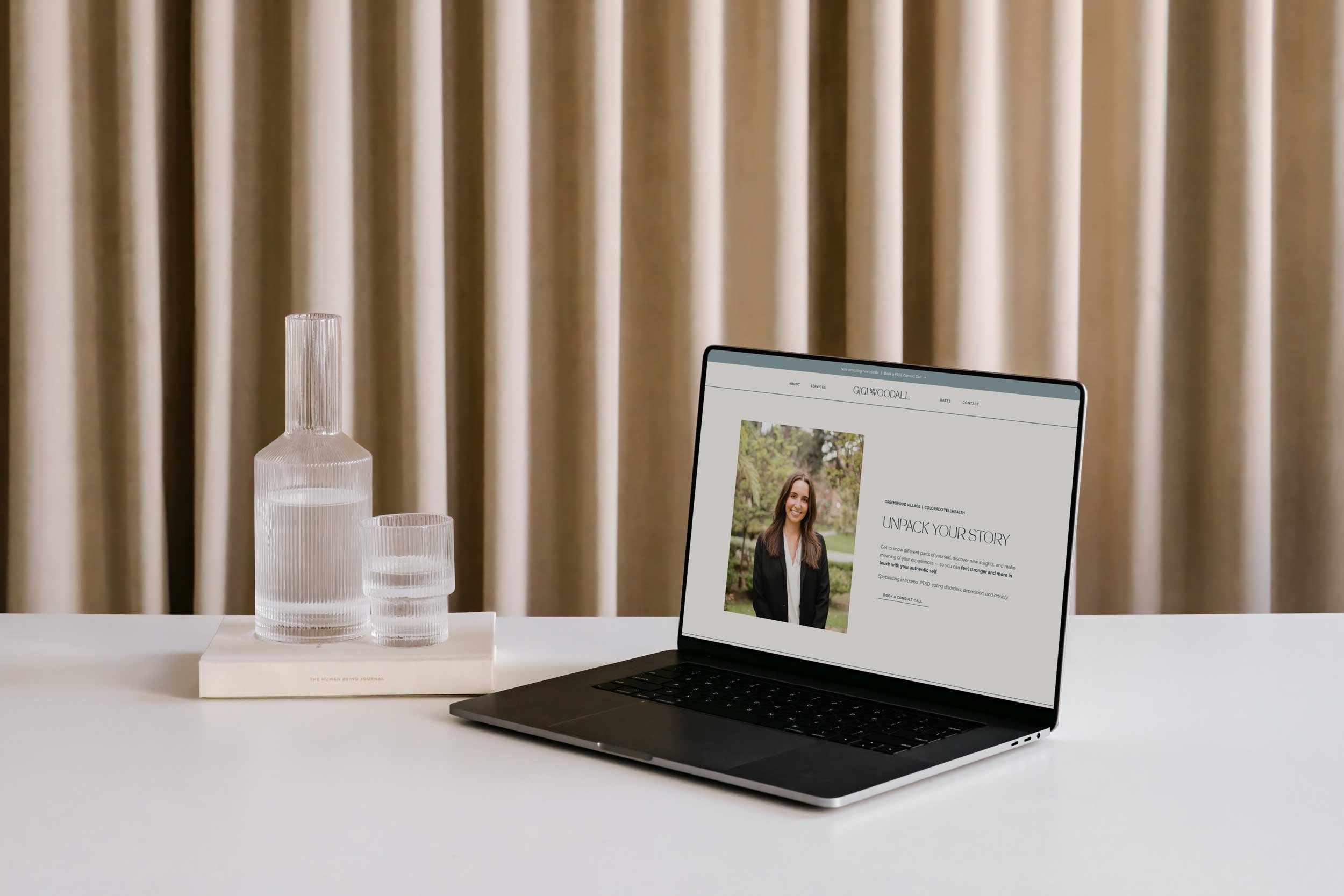
Core Sections Every Best Therapist Website Needs
If you’re wondering, “But what should I include on a one-page site?”—don’t worry. I’ve got you covered.
Here are the essential sections that every one-page therapist website should have to feel complete:
1. Intro
A warm, welcoming section that introduces you and immediately helps visitors feel safe and seen.
2. Approach
Share your unique philosophy, your therapeutic style, and how you help clients achieve the transformation they’re seeking.
3. Services
Give a clear, high-level overview of what you offer (think: individual therapy, couples counseling, group workshops, etc.).
4. Credentials
Highlight your education, licenses, certifications, and any specialized training that sets you apart.
5. Contact
Make it super easy for visitors to reach out, book a consultation, or send a message. (Pro tip: A simple contact form right on the page works wonders!)
When these elements are thoughtfully laid out, your site feels cohesive, trustworthy, and action-driven—exactly what the best therapist websites do.
You Don’t Need a Full Rebrand to Look Professional
Another reason one-page sites are often the best therapist websites? You don’t have to invest in a full rebrand to have a cohesive, professional look.
Seriously. You can create a beautiful, calming online presence with a mini-branding kit—think: a simple logo, a couple of curated fonts, and a soothing color palette.
That’s it.
These small but mighty details go a long way toward making your website feel aligned, polished, and intentional—without the heavy lifting (or heavy price tag) of a full brand overhaul.
And bonus: having a mini brand kit means you’ll also have assets ready for your Instagram posts, email signature, and anywhere else you show up online.
Built to Grow With You (When You’re Ready)
Maybe right now you’re just starting out, and a one-page website feels like plenty. But what happens when you’re ready to grow?
No worries—a strategic one-page design can easily expand later on!
Many of the best therapist websites start small and grow over time, adding features like:
A blog to share your expertise and boost SEO
Online booking or scheduling tools to streamline your client onboarding
Resource libraries for clients (hello, passive income opportunities!)
Your first website doesn’t have to be your forever website. Starting simple leaves you room to evolve—and that’s a beautiful thing.
Perfect for Launching, Pivoting, or Refreshing
Whether you’re just launching your private practice, pivoting into a new niche, or refreshing a site that hasn’t been updated since...2012, a one-page site could be exactly what you need.
Here’s why one-page designs make the best therapist websites in these situations:
Launching: Get online faster and start building credibility right away.
Pivoting: Quickly realign your messaging without rebuilding a whole new site.
Refreshing: Modernize your look and make it easier for clients to connect with you.
Plus, starting with a one-page site gives you clarity. It forces you to really hone your message—and that is what leads to deeper client connections (and more bookings).
Ready to Create One of the Best Therapist Websites Out There?
If you’re feeling overwhelmed by the idea of building a huge, complicated website—take a deep breath. You don’t have to do it all at once. Some of the best therapist websites start small, stay focused, and make a big impact. A calming, clear online presence is absolutely within reach—and I’d love to help you create it.
Ready to create a website that feels just right for you and your clients? Let’s talk!
Oh, and don’t leave without grabbing some free resources. Whether you need a ready-to-use Lead Magnet Template, a step-by-step guide to gathering testimonials with The Feedback Formula, or the Ultimate Blog Writing Checklist, I’ve got you covered. Grab yours today!